
The
denotation of this Reebok advertisement is that Reebok have used the popular rapper 50 cent as their
subject matter .In this
image there are also two pieces of text, which are a quote by 50 cent as well as a bolder piece of text that says 'i am what i am'. On the right hand side of the
image the background is a set of finger prints. The whole
image has a black and white
colour scheme which has strong
connotations of realism because its very bold and it makes the writing stand out which suggests that the phrases have strong and or significant meaning to the advertisement and Reebok wanted them to stand out. Furthermore, the
framing of the advertisement is just a plain black line which could suggest that Reebok wanted a raw, gritty and open honest advertisement with nothing fancy to add to their advertisement to show a possible harsh reality that people like 50 cent faced in their lives. This could show that Reebok also want to be able to relate to their audience. The
composition of the whole
image is quite separate because it's split completely down the middle with the
close up of 50 cent on the left hand side and the fingerprints with the majority of the writing and
logo of Reebok on the right hand side. However the main 'tagline' of the
image has the words 'i am' more towards the left side of the
image which clearly indicates to the audience that the advertisement is about or for 50 cent.The
Font is quite hip hop like and the 'i am what i am ' stands out a lot more than 50 centsquote which is a clear indication that its the slogan/ tagline. In terms of
lighting ,for 50 cent, its quite focused on his face yet there are some shadows around his cheekbones and eyes which link to the idea of secrecy,mystery, anger and seriousness which is also shown by the
pose in which 50 cent is standing.
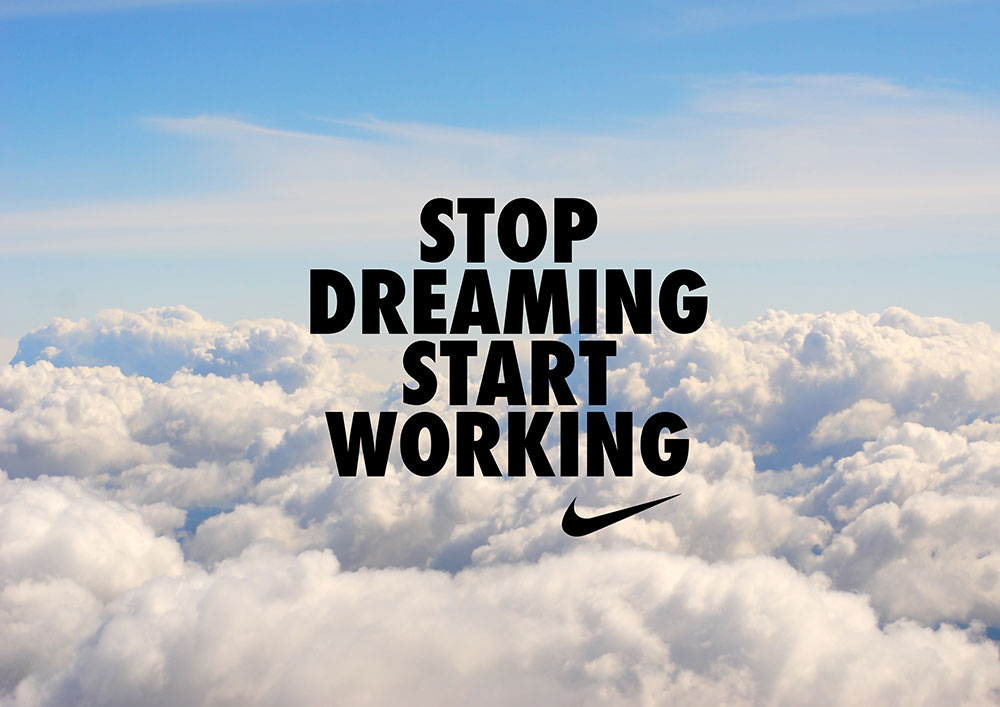
The
denotation/composition of this
image is the clear bold black writing, the Nike tick
logo and the background of clouds and sky. The use of clouds as the background directly links to the writing that stands out in the centre of the picture this is because clouds usually represent fantasy, peace and happiness and the word " dreaming", used in the main text, reflect those words. the
images main
colour of the background white and blue which are quite calm
colours however the text is in a strong black
font which contrasts heavily with the background . However Nike have purposely done this to impact their
target audience which is most likely the youth. This is because of the "inspirational" words used to motivate the youth into making something of themselves instead of doing nothing. Also the use of the Nike
logo not only promotes their brand but also shows the youth that Nike is "on the youths side". the
Image hasn't got any actual
lighting as the bright colours provide the light and the light and dark create clear contrasts to then attract more of an audience as the image stands out. The
subject matter of the advertisement is the bold text as Nike really want to inspire their target audience and therefore make a really bold statement, like they always do.
 The denotation of this Reebok advertisement is that Reebok have used the popular rapper 50 cent as their subject matter .In this image there are also two pieces of text, which are a quote by 50 cent as well as a bolder piece of text that says 'i am what i am'. On the right hand side of the image the background is a set of finger prints. The whole image has a black and white colour scheme which has strong connotations of realism because its very bold and it makes the writing stand out which suggests that the phrases have strong and or significant meaning to the advertisement and Reebok wanted them to stand out. Furthermore, the framing of the advertisement is just a plain black line which could suggest that Reebok wanted a raw, gritty and open honest advertisement with nothing fancy to add to their advertisement to show a possible harsh reality that people like 50 cent faced in their lives. This could show that Reebok also want to be able to relate to their audience. The composition of the whole image is quite separate because it's split completely down the middle with the close up of 50 cent on the left hand side and the fingerprints with the majority of the writing and logo of Reebok on the right hand side. However the main 'tagline' of the image has the words 'i am' more towards the left side of the image which clearly indicates to the audience that the advertisement is about or for 50 cent.The Font is quite hip hop like and the 'i am what i am ' stands out a lot more than 50 centsquote which is a clear indication that its the slogan/ tagline. In terms of lighting ,for 50 cent, its quite focused on his face yet there are some shadows around his cheekbones and eyes which link to the idea of secrecy,mystery, anger and seriousness which is also shown by the pose in which 50 cent is standing.
Comments
Post a Comment